Hacking Ghost blog design

Finally, I've moved this blog to a domain that I own using ghost.io, also known as Ghost(Pro), as a blog engine. In this post, I wanted to share tips, tricks, and hacks I used in my Ghost customization.
I decided to use a Ghost(Pro) platform instead of a self-hosted Ghost instance. The reason is quite simple: I'm not a front-end developer, and I'm also not a DevOps engineer. So I followed an old student's advice, "it's better to overeat than to undersleep," and figured that it's better to have a bad design and good hosting rather than bad design and even worse hosting. I think it was an OK decision.
The following is a somewhat detailed walkthrough of the changes I ended up with. If you are in a hurry or prefer to see it in the code, here is a link to the corresponding files in the repo. Spoiler alert: there are no tests 😱
For those of you who are still here, let's continue.
After playing with themes available with my starter Ghost(Pro) subscription, I've settled on Casper. I was looking for a theme that should do certain things. Here is my understanding of the scope of customization I needed to implement:
- be available for my starter subscription ✅ – works as is
- have minimalist design ⚠️ – maybe, still too much for my taste, but definitely minimalist considering the alternatives
- look ok in mobile browsers ✅– works as is
- support dark/light color themes ⚠️ – kinda, but colors are not ideal, and there is no toggle available for a user
- support search ✅– works as is
- show tags ⚠️ – shows only the primary tag for each post
- support code syntax highlighting ✅ – works with a third party (say Prism)
- have an RSS feed link ⚠️ – can be added with customization
Overall it seemed like a good one to start using.
I am skipping all the ✅ things that Ghost(Pro) and Casper support out of the box. Let's get to the interesting ones that I marked as ⚠️ above.
Minimalist design and color tweaks
Ghost(Pro) supports customization with header and footer code injections, so we'll use those to add things that are missing and update things that need updating.
Changes to make Casper's minimalist design even more minimalist are actually pretty simple, although they take time and some investigation. We just update the corresponding CSS styles in our header customization.
Dark and light themes
What's good about Casper is that it handles a system theme color preference by default, using the prefers-color-scheme media feature. That is enough for now. As I mentioned, default colors aren't impressive, so we can use the approach as before and update styles. I won't explain these changes in detail; better just to browse the CSS chunks of the ghost_head.hbs file in the repository.
The more interesting part is allowing users to set a theme from the UI explicitly. After we're done with other important stuff, we'll do it as a bonus later.
Tags
Ghost allows you to tag or categorize your posts. the platform also provides default URLs for browsing by tags. Very convenient.
But as soon as I started experimenting with it, I found out that only the first tag makes it into UI; they call them primary tags. I personally think it's a strange design decision, but I'm sure the authors had their reasons.
With a self-hosted Ghost instance, you have full control over the theme templates, so it's a matter of creating your own template. and, of course, it's not my case 😂
Thinking about this problem further, I had an idea. I already knew that Ghost automatically generates an RSS feed for blog posts. and the RSS feed happens to have all the tags I need, e.g.
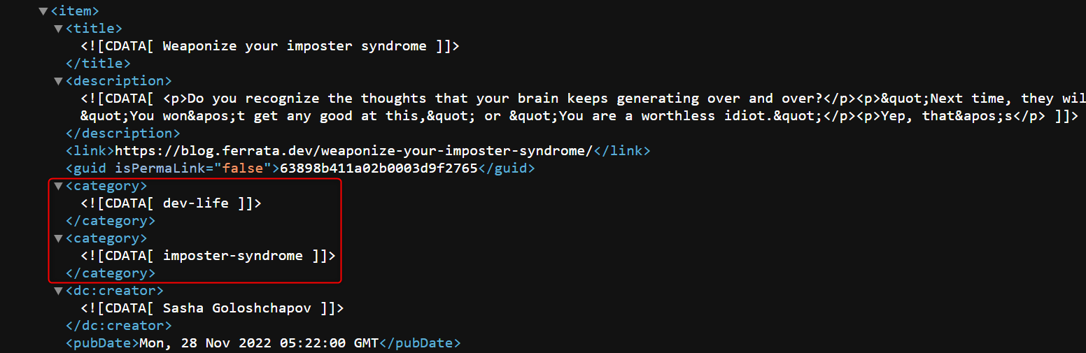
So the idea is to pull this RSS feed while the page is loading and dynamically add missing tags using JavaScript.
<script defer>
  // load extra tags
  fetch("https://blog.ferrata.dev/rss")
    .then(response => response.text())
    .then(str => new window.DOMParser().parseFromString(str, "text/xml"))
    .then(data => {
      const extraTags = {};
      const items = data.querySelectorAll("item");
      items.forEach(item => {
        const postUrl = item.querySelector("link").innerHTML;
        extraTags[postUrl] = []
        const tags = item.querySelectorAll("category");
        tags.forEach((tag, index) => {
          if (index > 0) {
            extraTags[postUrl].push(tag.firstChild?.wholeText?.trim())
          }
        });
      });
      return extraTags;
    })
    .then(allExtraTags => {
      if (document.body.classList.contains("post-template")) {
        const extraTags = allExtraTags[document.location] ?? [];
        const tags = document.body.querySelector("div.post-card-tags");
        if (!!tags && extraTags.length > 0) {
          extraTags.forEach(
            extraTag => tags.insertAdjacentHTML("beforeend", `
              <span class="post-card-primary-tag">
                <a href="/tag/${extraTag}/">${extraTag}</a>
                </span>`)
          );
        }
      } else {
        const posts = document.querySelectorAll("a.post-card-content-link");
        posts.forEach(post => {
          const extraTags = allExtraTags[post.href] ?? [];
          const tags = post.querySelector("div.post-card-tags");
          if (!!tags && extraTags.length > 0) {
            extraTags.forEach(
              extraTag => tags.insertAdjacentHTML("beforeend", `<span class="post-card-primary-tag">${extraTag}</span>`)
            );
          }
        });
      }
    });
</script>
Now the tags appear, but kinda in an ugly way, jumping at you out of nowhere. we can at least make them appear in a smooth way with an animation CSS trick:
  @keyframes fadeIn {
    0% {
      opacity: 0;
    }
    100% {
      opacity: 1;
    }
  }

  .post-card-primary-tag {
    padding: 0.7em;
    border-radius: 1.5em;
    background-color: var(--ghost-accent-color);
    color: var(--color-lightgrey);
    animation: fadeIn 0.5s;
  }
And all our tags are populating now!
Syntax highlighting
One of the common approaches seems to be using Prism. So I followed the instructions, downloaded the necessary files, and hosted them on the same domain. Here is how I included those.
<link rel="stylesheet" href="https://ferrata.dev/css/prism.css">
<script src="https://ferrata.dev/scripts/prism.js"></script>
But for some reason, by default, it looked ugly in dark mode and also not wrapping text correctly for line-numbers style.
After playing with that more, I ended up tweaking colors for it like this:
  code[class*=language-],
  pre[class*=language-] {
    text-shadow: initial;
  }

  pre.line-numbers {
    white-space: pre-wrap;
  }

  .language-css .token.string,
  .style .token.string,
  .token.entity,
  .token.operator,
  .token.url {
    background: initial;
  }
Also added some code to show a copy icon next to the Copy tooltip. So now I like it.
  .copy-to-clipboard-button {
    margin-top: 0.5em !important;
    font-size: 1em !important;
  }

  button.copy-to-clipboard-button::before {
    font-family: FontAwesome;
    font-weight: normal;
    font-style: normal;
    display: inline-block;
    text-decoration: inherit;
    padding-right: 0.5em;
    padding-bottom: 0.5em;
    content: "\f328";
  }
RSS feed link
This one was a bit tricky, although the code is straightforward:
  .site-footer .rss-feed {
    font-size: 2em;
    margin-bottom: 0.5em;
  }
<script>
const addRssFeedLink = () => {
document
.body
.querySelector("footer.site-footer .inner")
.insertAdjacentHTML("afterbegin", `
<div class="rss-feed">
<a href="https://blog.ferrata.dev/rss/"><i class="fa-solid fa-square-rss"></i></a>
</div>`);
}
addRssFeedLink();
</script>The trick is that I did it in footer injection, so by the time the code executes, we already have all the needed page elements.
Bonus: color theme switch
As for the promised bonus, here is how I created the color theme switch.
Actually, we don't need the switch. As I said before, the Casper theme follows the system color settings, so the blog looks good enough by default. But good enough is not something we stop at, right? We want an explicit way for a user to set the desired behavior and for the browser to remember and respect it.
It turns out that Casper adds special classes to html tag to distinguish between color themes:
auto-color– for a system-defined color themedark-mode– for a dark theme color theme- otherwise, the color theme is considered light
So the idea would be to provide a switch control and to update this class name when the user clicks on the switch. Here is my take on this:
  .theme-switch {
    cursor: pointer;
    display: inline-flex;
    justify-content: center;
    align-items: center;
  }

  .control-tooltip:hover::before {
    content: attr(tooltip-text);
    text-align: right;
    width: max-content;
    border: 1px solid;
    border-radius: 1.5em;
    padding: 0.3em 0.7em 0.3em;
    position: absolute;
    transform: translate(-30%, -2.3em);
    animation: fadeIn 0.5s;
  }
<script>
const getTheme = () => {
return window.localStorage.getItem("theme") ?? "system";
};
const setTheme = (theme) => {
const html = document.querySelector("html");
html.classList.remove("auto-color");
html.classList.remove("dark-mode");
if (theme === "system") {
html.classList.add("auto-color");
window.localStorage.removeItem("theme");
} else {
if (theme === "dark") {
html.classList.add("dark-mode");
}
window.localStorage.setItem("theme", theme);
}
};
const setThemeIcon = (theme) => {
const icons = {
"system": "fa-solid fa-circle-half-stroke",
"dark": "fa-solid fa-moon",
"light": "fa-solid fa-sun"
};
document
.querySelectorAll("div.theme-switch i")
.forEach(control => {
control.className = icons[theme];
control.parentNode.setAttribute("tooltip-text", `${theme} theme`);
});
};
const setNextTheme = () => {
const themeOrder = {
"system": "dark",
"dark": "light",
"light": "system"
};
const next = themeOrder[getTheme()];
setTheme(next);
setThemeIcon(next);
};
const theme = getTheme();
setTheme(theme);
</script>
<script defer>
// inject a theme switch
window.addEventListener("load", () => {
document
.body
.querySelector(".gh-head-brand button.gh-search")
.insertAdjacentHTML("beforebegin", `<div class="theme-switch control-tooltip"><i></i></div>`);
document
.body
.querySelector(".gh-head-actions button.gh-search")
.insertAdjacentHTML("beforebegin", `<div class="theme-switch control-tooltip"><i></i></div>`);
setThemeIcon(getTheme());
document.querySelectorAll("div.theme-switch").forEach(control => {
control.addEventListener("click", e => {
setNextTheme();
});
});
});
</script>I was following the search functionality, so technically, there are two switches, one per each media query width.
Some side notes
Overall I like how it turns out, but a couple of things still bother me.
- how do I test all this stuff?
- was it a stupid idea not to self-host?
I guess I will figure out the answers later.